tl;dr - Visit States on States
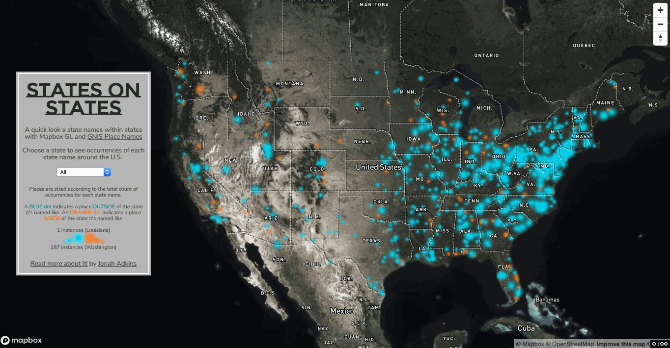
Welcome to 2020. Where in the hell is Kansas City?
It’s been a busy start to the new year, which has meant less time for fun map experiments. I was able to carve out a few hours this weekend to explore an interesting phenomenon.
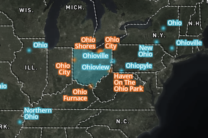
In their awesome infinite wisdom, the people who name places absolutely love naming places after states. For example, Kansas, Georgia or Florida, Colorado.
I’m fairly sure a lot of these aren’t real places, more like these weird named things that have existed only because it was put on a map once and never removed in subsequent editions, it’s also worth noting the etymologies of these names that are endlessly re-used.
Source Data
To explore this further, we’ll need a pretty solid dataset of place names. In the U.S. we have GNIS, the Geographic Names Information System. This dataset is provided by the US Board on Geographic Names, a division of the USGS. According to their website:
The U.S. Board on Geographic Names (BGN) is a Federal body created in 1890 and established in its present form by Public Law in 1947 to maintain uniform geographic name usage throughout the Federal Government. The BGN comprises representatives of Federal agencies concerned with geographic information, population, ecology, and management of public lands. Sharing its responsibilities with the Secretary of the Interior, the BGN promulgates official geographic feature names with locative attributes as well as principles, policies, and procedures governing the use of domestic names, foreign names, Antarctic names, and undersea feature names.
So the BGN basically works with other federal orgs and state orgs to determine what constitutes a place. The data we need for this can be downloaded by state or as one large national file, which is a 315mb text file. Once downloaded, its apparent we’ll need some to some processing on the data before it becomes usable.
QGIS
The text file is easily converted to geographic points in QGIS by using Layer -> Add Layer -> Add Delimited Text Layer and using the dialog to pick the appropriate latitude and longitude fields from the large text file. We’re also going to limit the data to just populated places - the source data has around 50 categories of named sites ranging from reservoirs and beaches to airports. According to the metadata a populated place is:
Place or area with clustered or scattered buildings and a permanent human population (city, settlement, town, village). A populated place is usually not incorporated and by definition has no legal boundaries. However, a populated place may have a corresponding “civil” record, the legal boundaries of which may or may not coincide with the perceived populated place. Distinct from Census and Civil classes.
Next, we’ll run through a bunch of string searches for each state name, and apply matches as a new column called nameLike. So if we searched the place name column for '%Virginia%', every match would get Virginia added in the new column. Once we’re done with that, we cant count every occurrence of each state name and add that count to a new column. ALSO - DC is not included in here, but Guam, and Puerto Rico are. I also want to style the map to show a difference in places that are in that state they’re named like vs. place outside of the state they are named like, so I calculated and in or out column based on matching the actual state the places is in to the reference for the named like state.
Finally, I deleted duplicates where Place Name, County Name, and State were the same. There were about 100 or so of those. I also removed about 100 instances where Mobile Home and Trailer Park were part of the place name. I know there’s probably some better and quicker ways to go about it, but this is what worked for me.
Mapbox
To get this data on the web, we’ll upload it Mapbox as a tileset, which will give us programmatic access to it using Mapbox GL JS. The main thing I want to do with this visualization is let the user select a state, and be shown all places that match that state. First, I created a color-drained basemap consisting of Mapbox imagery, state names, and admin boundries. Up next was adding my new GNIS layer twice, once as styled points, the second as styled labels. For the points, we’ll use the interpolate property on the circle size using the occurrence count column from our data. This makes the point size small to large based on how many occurrences of that states name. I’ll note that its a lot easier to style the data in Studio, then download the json file and use the style code from there to add to the map.addLayer({ part of my GL-JS code. And finally, I added state boundaries from the new Mapbox Election dataset - i’m not using any of the election data, just the filled state polygons with their name attributed.
With the layers added to the map, I can add in some code to add a popup on hover, and an if-else statement that will apply the filter and visibility to my layers once they are selected via a dropdown.var prop = document.getElementById('prop');
prop.addEventListener('change', function() {
if ([prop.value] == 'default') {
map.setFilter('points-in', [
"match",
["get", "In_Out"],
["IN"],
true,
false
])
map.setFilter('points-out', [
"match",
["get", "In_Out"],
["OUT"],
true,
false
])
map.setFilter('labels-in', [
"match",
["get", "In_Out"],
["IN"],
true,
false
])
map.setFilter('labels-out', [
"match",
["get", "In_Out"],
["OUT"],
true,
false
])
map.setFilter('states')
map.setLayoutProperty('states', 'visibility', 'none');
map.setLayoutProperty('labels-in', 'visibility', 'none');
map.setLayoutProperty('labels-out', 'visibility', 'none');
} else {
map.setFilter('points-in', ["all",
["match", ["get", "In_Out"],
["IN"], true, false
],
["match", ["get", "NameLike"],
[prop.value], true, false
]
])
map.setFilter('points-out', ["all",
["match", ["get", "In_Out"],
["OUT"], true, false
],
["match", ["get", "NameLike"],
[prop.value], true, false
]
])
map.setFilter('labels-in', ["all",
["match", ["get", "In_Out"],
["IN"], true, false
],
["match", ["get", "NameLike"],
[prop.value], true, false
]
])
map.setFilter('labels-out', ["all",
["match", ["get", "In_Out"],
["OUT"], true, false
],
["match", ["get", "NameLike"],
[prop.value], true, false
]
])
map.setFilter('states', ["match", ["get", "name"],
[prop.value], true, false
])
map.setLayoutProperty('labels-in', 'visibility', 'visible')
map.setLayoutProperty('labels-out', 'visibility', 'visible')
map.setLayoutProperty('states', 'visibility', 'visible');
}
});
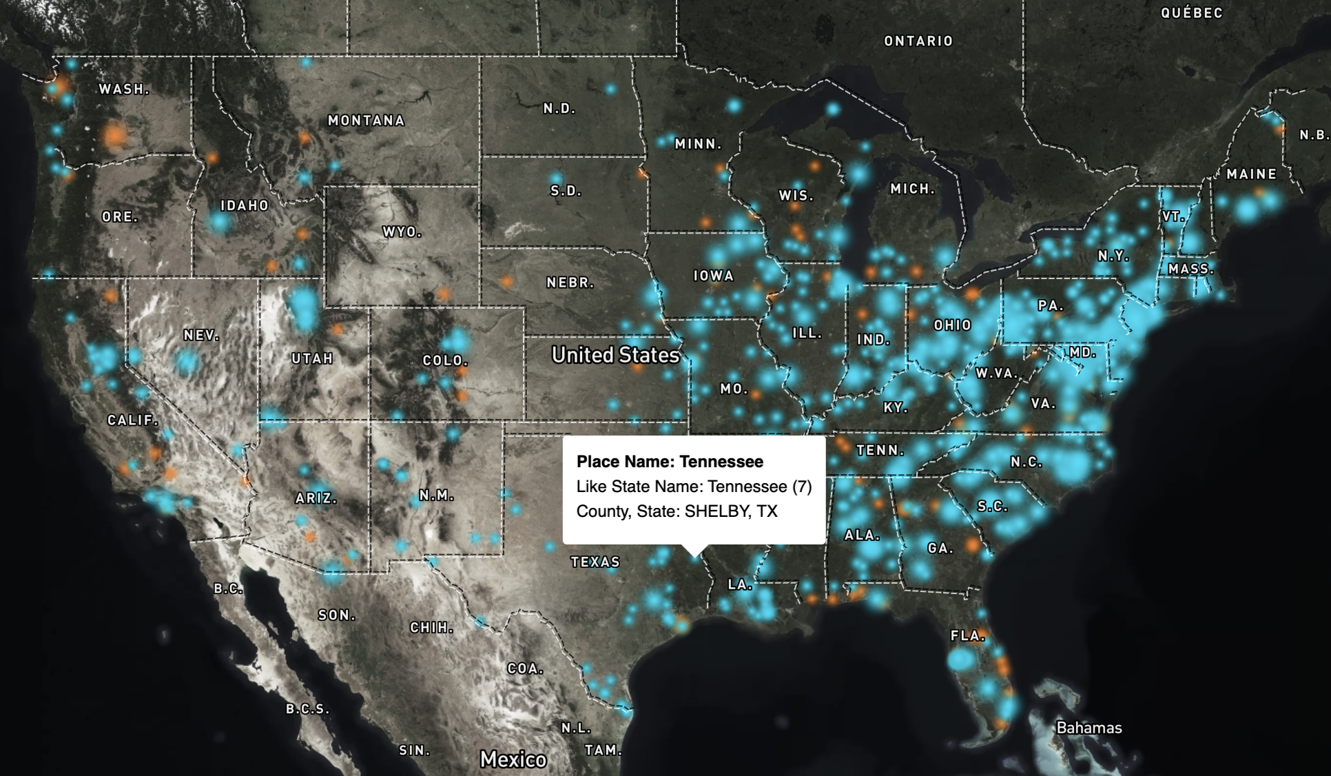
It’s important to include a default of all states so the map is populated with all locations, that’s the if part, the else part looks for matches in the dropdown to my GNIS data and turns the data on for just the matches through setFilter and setLayoutProperty. Now the user can go back and forth between all states or just a single state. Also, once a single state is selected, the elections data we added shows the state as filled transparent polygon, so the user can see both state and it’s similar place names.
You can see the code for my one-page app here.
Finishing Touches
We’ll make this little app presentable by making use of Google Fonts by way of Katy Decorah’s awesome font explorer. Since we used an interpolate property in our layer style, we’ll want to add a small legend. We can replicate the circle style using css, like this:.dot-left-small {
height: 5px;
width: 5px;
background-color: hsl(187, 100%, 49%);
border-radius: 50%;
display: inline-block;
box-shadow: 0 0 1px 1px hsl(187, 100%, 40%);
filter: blur(2px);
}
.dot-left-medium {
height: 10px;
width: 10px;
background-color: hsl(187, 100%, 49%);
border-radius: 50%;
display: inline-block;
box-shadow: 0 0 1px 1px hsl(187, 100%, 40%);
filter: blur(2px)
}
.dot-left-large {
height: 20px;
width: 20px;
background-color: hsl(187, 100%, 49%);
border-radius: 50%;
display: inline-block;
box-shadow: 0 0 1px 1px hsl(187, 100%, 40%);
filter: blur(3px)
}
and then in the html, we add:places are sized according to the total count of occurrences for each state name
<br> 1 instance (Louisiana)
<br><span class="dot-small"> </span> <span class="dot-medium"> </span> <span class="dot-large"></span>
<br>187 instances (Washington)
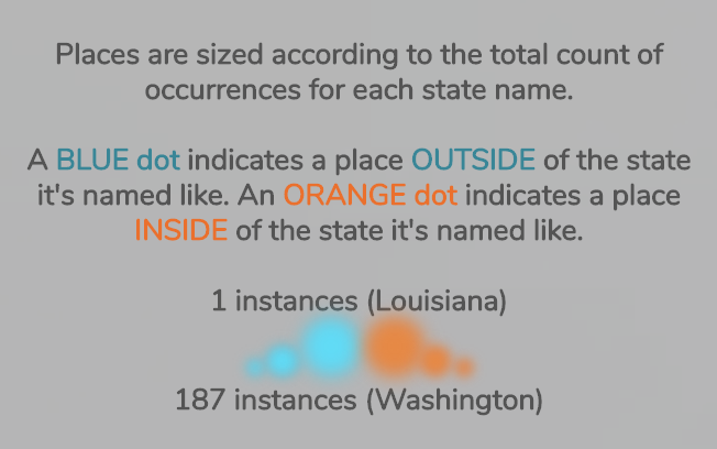
it’s not exact but it’s pretty close. All in all, it was a fun little project to experiment and learn some new things on!
Random Things…
… I should have done/fixed.
- try OSM first
- my Mapbox tileset returns
Error: Invalid LngLat object: (NaN, NaN)orError:LngLatLikeargument must be specified as a LngLat instance, an object {lng: <lng>, lat: <lat>}, an object {lon: <lng>, lat: <lat>}, or an array of [<lng>, <lat>]for some of the points when hovering. This was probably because there were some random multipoint geometries, which have since been fixed. - done some better RegEx to limit it to singular instances of state’s name (only California, not California Junction or only Indiana, not Indianapolis)
- styled the dropdown
- I never think about how it looks on mobile
- Washington DC should be a state, therefore part of this as Columbia and Washington
major props to Vicky for proofing all this for me!
Got questions or comments? Feel free to email me or hit me up on twitter.